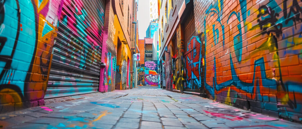
This project incorporated all of the concepts that we have covered thus far. It started out requiring me to research a fine art artist and their artwork. Through my research, I came across the artist John Andrew Perello, also known as the artist: JonOne. I chose him because he had a unique style to his work. He is a self-taught artist who started out doing graffiti in the streets of Harlem. His work embodies the concept of “freestyle” and is influenced by his experiences and the hip-hop and street life culture.
This project required me to use tools & techniques that I have learned in Photoshop to digitally manipulate the artist’s headshot photo with his three (3) pieces of artwork that I selected to create a new portrait that represents the style of the artist.
The three (3) pieces of the artist’s artwork that I selected were:
- Solutions for #6
- Typography
- The Sun is Shining
I chose these three pieces of artwork because of the vibrant colors in two, and the graffiti like characteristics in the third.
John Andrew Perello, also known as the artist: JonOne
Born of Dominican origin, John Andrew Perello, but
goes by the alias JonOne, was born and raised in Harlem, New York. His artwork started out as graffiti in his neighborhood streets at the age of 17. Although his work was viewed as graffiti, he rose above what was considered the norm of urban street art and graffiti and addresses of concept of
freestyle. He is a self-taught artist who left New York in 1978 for Paris, where he resides and still performs his artistry.
His Artwork
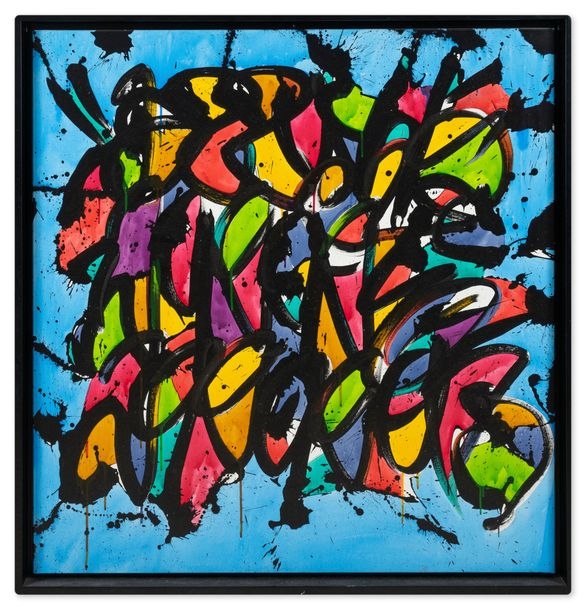
Solutions for #6 (2011)
I chose this piece because of the colors he used. I also love the graffiti like letters he has blended in the center of the colors. It reminds me of a stained glass window, but with some street art in the center.
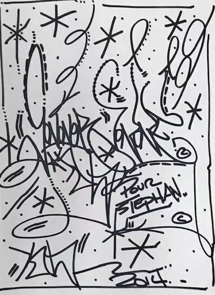
Typography (2014)
This piece looks like he was experimenting with the arrangement of type and the use of symbols. It’s different then most of his work, which incorporates a lot of colors, but this one he stuck with the simple black and white (or grey scale). It resembles a bunch of graffiti tags that you would see displayed in the subway stations, on buildings, etc.
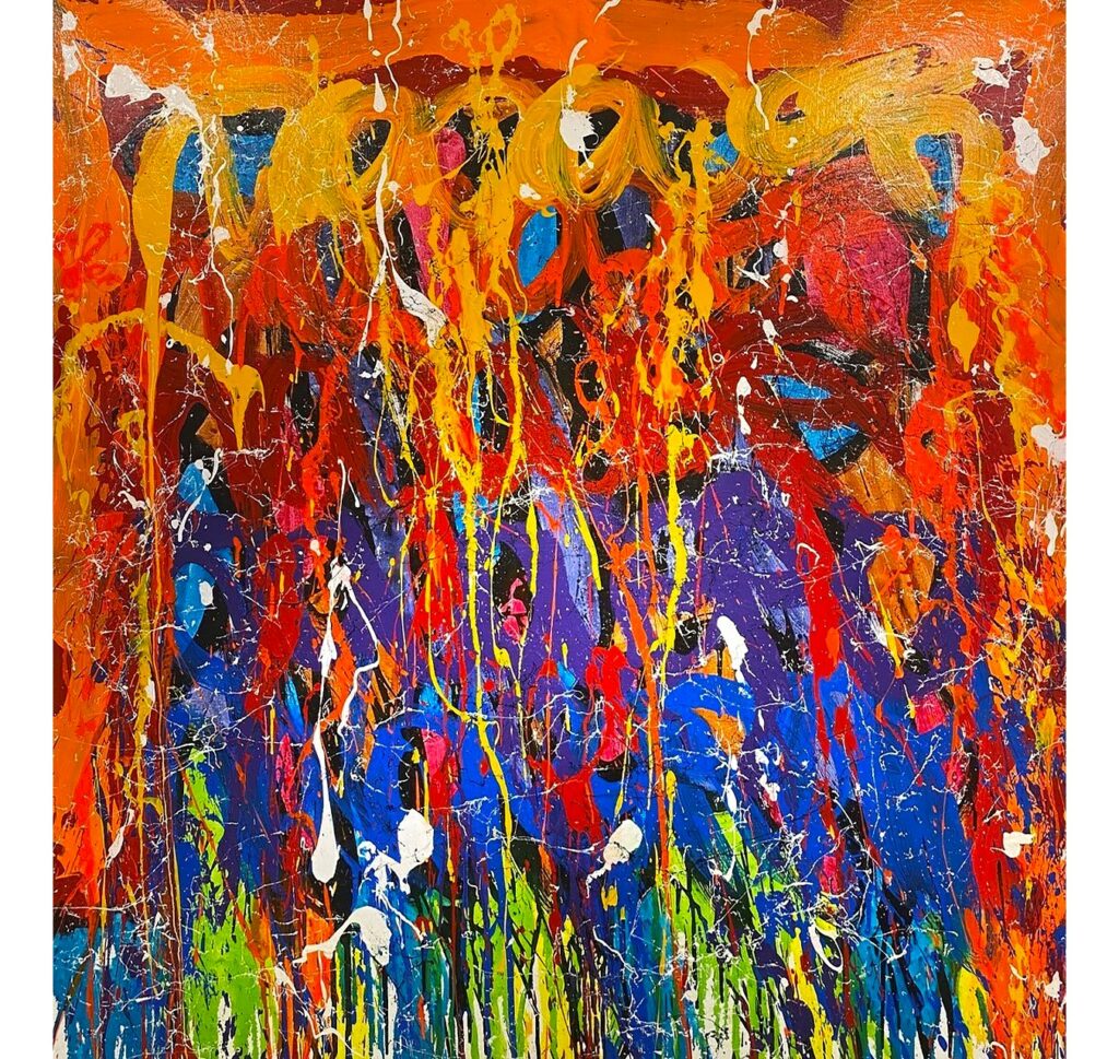
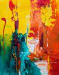
The sun is rising (n.d)
This final piece of JonOne doesn’t necessarily strike me as graffiti, but I can visualize the rising of something from bottom up. The contrast of colors and the use of primary to create those secondary colors is strikingly interesting. Even though it seems like just the blending of colors, you still can see almost some graffiti tag in the top center of the artwork in an orange tone.
My Portrait: JonOne
From the beginning of this project, I wanted to keep as much of the artist’s face visible but still incorporate his artwork into parts of his face. I started out by creating a vector mask of his face/neck only and then one of his t-shirt. With both of those, I used the blending options to blend those masks with whatever I placed in the layer beneath.

I thought it would be interesting to cut out one of his eyes with the pen tool to show the Typography piece that I layered underneath it, then used the blending options again to blend that piece into his face. His initial portrait was already set-up in what looks like a picture frame, so I decided to use that to contain his “Solutions for # 6” piece and place his piece “The Sun is Rising” as the outside border by layering it beneath all the pieces.