This is my final project for ART 106-200, and final use of Adobe Photoshop for the course. This project required: Thumbnails of the poster concepts, poster first draft of the two (2) select concepts, the final poster comp of the overall selected design, and a multimedia presentation of the final design.
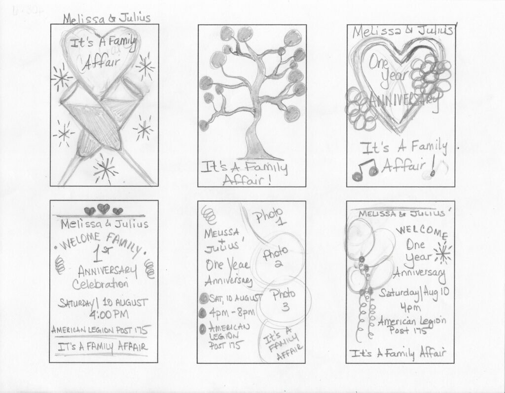
Thumbnail: Poster Concepts
This event is actually my event that is scheduled for next month, August 2024.
I tried to incorporate the words “It’s A Family Affair” into all of the thumbnails. It is a celebration of our One Year Anniversary, but more so of a way to get our family and friends together to celebrate with us since we got married at the courthouse last year. It is fairly going to be a non-traditional event, although my husband and I will still be dressed as if we are just getting married.
Once I place my ideas in Photoshop I plan to add the extra details to it that I was not able to add in the thumbnails. I plan to incorporate our colors which are forest green, navy blue, and silver as our theme colors.
The two (2) thumbnail that I chose to work with are the top left and top right designs.
Draft: Poster Comps
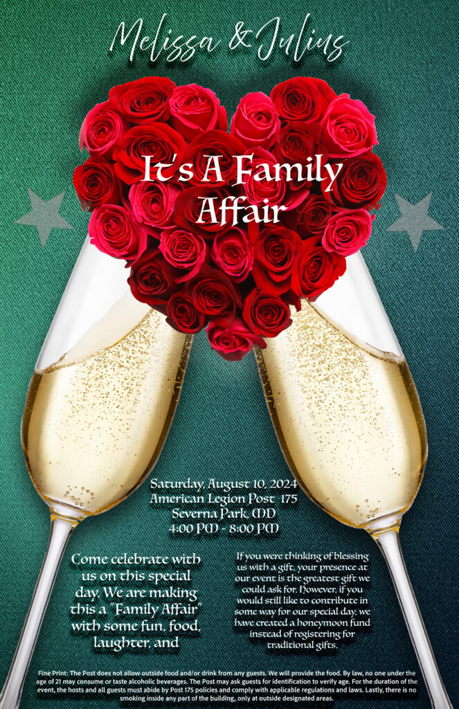
For the names in both designs, I used the font “Above the Beyond Script Regular” because it gave the design a more elegant feel. I also used “Luminari” for the remainder of the words. I didn’t want to make all of the font elegant, so that is why I can’t it up for the rest.

I found a free stock photo for the background for the first piece, then I used AI to generate the background for the second piece. I wanted the hearts to be one layer above the background and the words to obviously be the top layer.
Final Poster

From feedback, I needed to work on the visual hierarchy from the draft. At first, the words for the anniversary and the family affair were fairly the same size, which made it difficult for the reader to determine what was the most important piece of information. So, I increased the font of the anniversary words, and decreased the font for the family affair words and placed them on one line.
I also removed the drop shadow from the text at the bottom and added a layer to create white rectangles below the text. I changed the opacity of the layered white rectangles so that you can faintly see them to help the text stand out better.
Although I did not adjust the main text on this multimedia, my focus was on highlighting highlighted the date/time and location of the event. I also wanted to highlight our names up top by adding a curve later and adjusting the opacity over our name throughout the clip. I attempted to do a slight animation to the glasses of champagne.
The only animation that was not successful in my opinion was the sparkle I attempted to add to the champagne glasses. Since I took a video clip from the free stock photos it was really challenging to adjust the video to only cover the liquid part of the glasses. The background of the video was also black which made it really difficult to hide it, so I had to adjust the opacity of it so much that you can hardly see it.
I do know now that I could have created the sparkles effect with tiny shapes and timed them in the timeline by turning them off and on during specific intervals. That would be a very tedious process but may have worked a lot better than the video clip I used.