This is project two of seven in the course. The task requires the creation of vector graphics through the process of: (1) creating graphics in Illustrator from raster images, (2) select an object (a stock image photo as the reference image) to create graphic stylizations, (3) create 6 hand-drawn sketches with pencil & paper, (4) create graphic stylization first draft using Illustrator, and (5) final presentation using Illustrator.
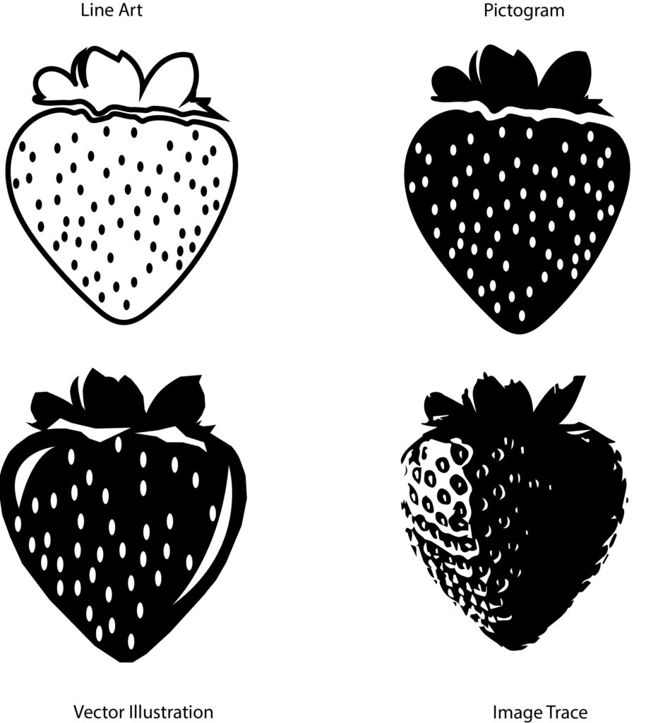
Step 1
Graphics in Illustrator from raster image stock photo
Step 2
Stock photo / reference image selected to create graphic stylizations

Step 3
6 hand-drawn sketches with pencil & paper

Step 4
Graphic stylization first draft using Illustrator

Starting out in this draft, the leaves ended up having the most focus. When I used the image trace tool, it showed the most texture of all vector images. I incorporated color in the last two images by highlighting the purple of blueberries (yes, I looked it up on the internet to see what colors blueberries actually are), and the green of the leaves. I made the stoke a darker purple in the bottom left image and the fill a slightly lighter purple to help the blueberries pop a little. The bottom right image, I decided to make the stroke white and fill a deep purple, just to do something a little different with color. I also made the stoke of the leaves white.
Step 5
Final presentation using Illustrator
Summary:
I chose a blueberry or blueberries. I chose them due to my love for the fruit and they are a fruit that I could really add varying textures to. The photo also had leaves that I could add texture and design to.
I decided to keep my first draft line art (#2) and pictogram (#3), but I went in to #3 and made the correction to the hidden leaf on the front berry. Numbers 4 and 5 are my first draft color vector renderings but I added a gradient to #4. I also added a gradient to #5 but I experimented with the burlap texturizer feature to give it roughness as blueberry skin tends to have. My number 6 is a completely new rendering, because as my feedback stated I needed to use just shapes filled with color without any outlines, so hence #6. I wanted to pull my hair out completing #6, because I struggled trying to create the top of the blueberries with shapes and lines and still hope to make them look somewhat realistic. I also added gradient to #6, both berries and leaves with a texture on them all, but I have to so I had so much fun making the leaves. I created yellow lines, added some anchor points and pulled them out to open up the yellow just enough.