Logos help to build brand identity. This is project five of seven for this graphic design 1 class. The project required that I establish a brand identity for myself by first designing my logo. Through the process of sketches, first draft and final presentation.
Sketches
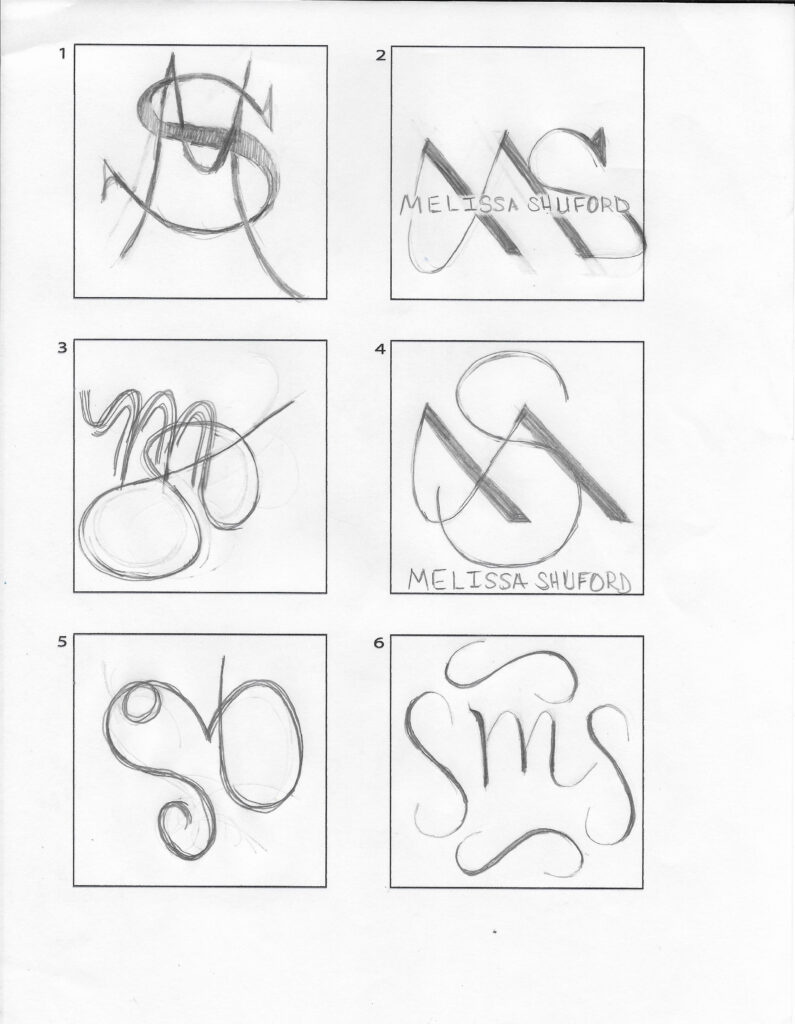
Logo Rough Draft
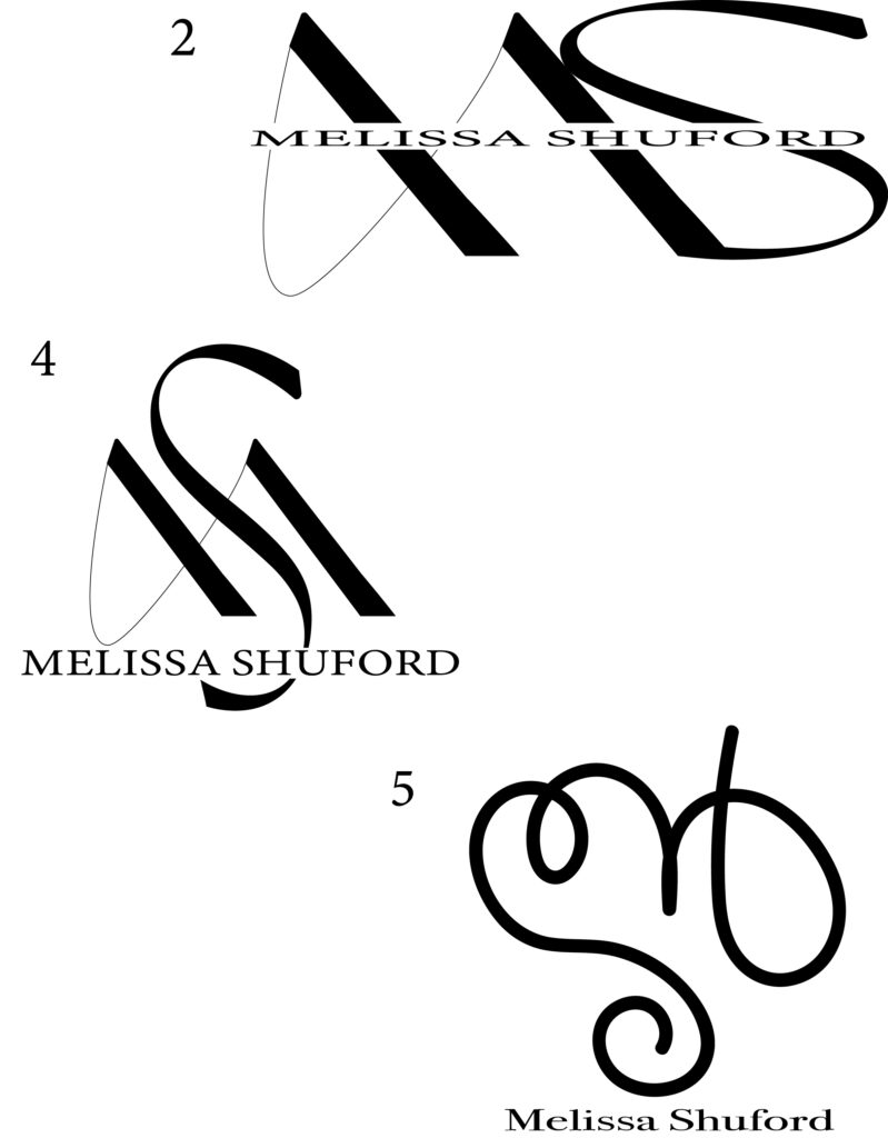
I did make a revisions to the “S” in both #2 and #4. When I selected a font that fit me and created an outline of it, I couldn’t for anything make some parts of the “S” thinner while leaving the rest fat. So, I decided to just widen the “S”, join it to the “M” and cut some of the tail off.
The concept/theme that I am trying to convey through each logo is simple, yet classy.Simple, yet classy.
The typefaces for the name typed out are Minion Variable Concept (regular) for my name in #2 & #4. Bodoni 72 Oldstyle (book) for my name in #5.
I love Navy Blue, so I am thinking about that “possibly” for my 1 color. For 2 color theme I am not really sure at this moment.
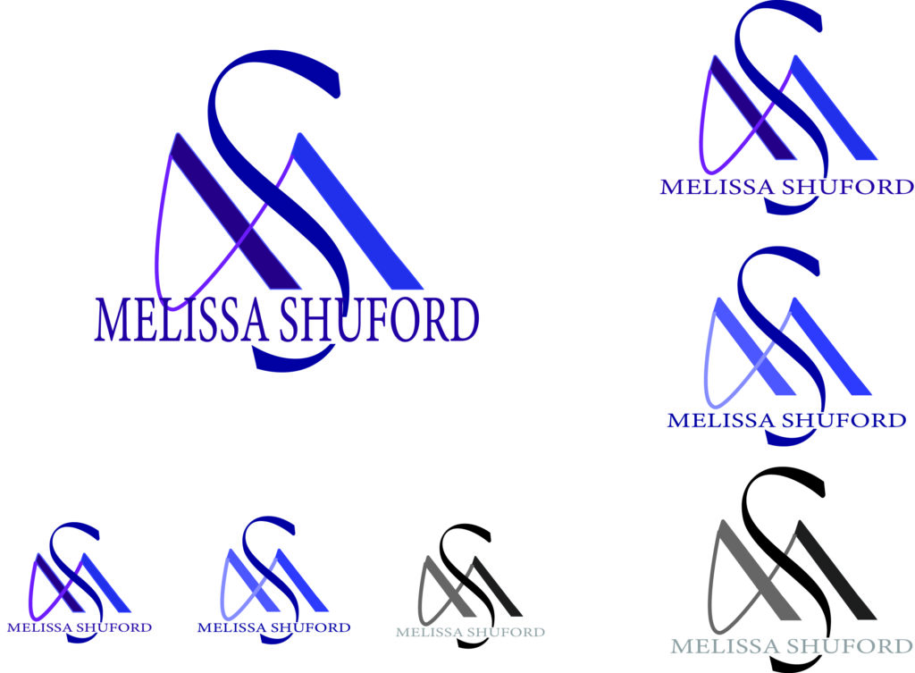
Logo & Identity Logosheet
For my 1-color I chose midnight blue, because a dark/deep blue is my favorite color. For my 2-color, I chose an analogous blend on Canva of midnight blue and like a plum or deep purple.
I think the 2-color logo is the most effective. This design really makes the logo stand out and the colors go well together.
Business Card Concepts
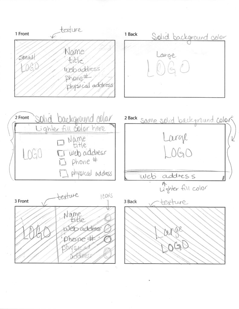
I included the 5 things that every business card should have: logo, name, contact info, web address, and physical address. I almost thought about excluding my name, because it’s already in my logo and that makes it kind of redundant.
I incorporated icons, texture, and somewhat of a rectangular shape at the top front of #2 and the bottom back of #2.
I would say #2 is the strongest design, because of the continuation of the rectangular shape at the top of the front which is repeated at the bottom of the back. Also, my portfolio web address is the most important piece of information on my card other than the logo, and #2 has that piece of information not only on the front, but also on the back.
I would say #3 is the weakest design, because I feel like texture on the front and back may be too much. It would be the same texture, but may be an overload.
Logo & Identity Presentation
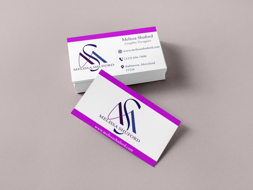
I chose my second business card concept to do my mockup and I think my logo is integrated into my business card fairly well. I used line and color as my design technique to connect the front to the back.
