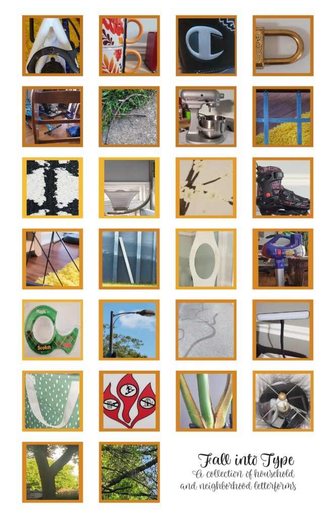
This is the first of seven projects for my Graphic Design 1 (ART 166-200) course. This assignment required that I visualize graphic design, by finding all 26 letters of the alphabet in my surrounding environment. After capturing those letters digitally, my task is to use Adobe Photoshop to enhance and crop them, then use Adobe Illustrator to create a poster design showcasing my environmental alphabet
Below is my online Flickr album to view the first draft of my environment alphabet.
Reflection Q&A:
- Which theme did you select and why?
- I selected a Fall theme since we are having that kind of weather now, and plus a lot of my images were taken outside in my community.
- What potential title(s) are you considering for the alphabet?
- (1) Welcome Fall (2) or something related to Fall or the outdoors
- In your opinion, which letter or letters are the strongest & why?
- The A, N, R, and Y. You can really see them clearly and they all seemed to be naturally formed in whatever object the photo was taken of.
- In your opinion, which letter or letters are the weakest & why?
- The C, D, K, P, Q1, and W. The all were just pretty hard to capture authentically and the image quality wasn’t good with the D and K.
Environmental Alphabet Final Presentation
Based on critiques, revisions were made and the final presentation was completed using Adobe Illustrator with the following criteria.
- Letters must be cropped, no more than 2″ wide or tall and 300 dpi.
- Ensure there is visual consistency between the letter images in terms of brightness, contrast, and tone.
- Final poster should be vertical in orientation and 11″ x 17″ at 300 dpi.
- Letters must be arranged in alphabetical order.
- Title should be creative and reflect the theme of the environmental alphabet.
- Title should be incorporated into the composition in a way that is balanced and purposeful.

I selected a totally different title “Fall into Type”, “A collection of household and neighborhood letterform”. I chose that because I wanted to make the title a little fun and catchy. The first design is the type font that I chose. I went onto Adobe Font and searched for autumn fonts and one of the closest ones that came up was Limon, so I chose that. I also went back into my letters and changed the image sizes to make them all square (2 x 2), and placed 4 in each row. Because of the amount of space at the bottom of the poster, I decided to do a right-justified of my text, but take all rows of text and somewhat move it to the center of that empty space to take up some of that white space.

